


By Jeremy Priest ·
Choosing the right color can be one of the hardest parts of designing custom neckwear. Whether you're coordinating a wedding palette, matching your organization's branding, or complementing a favorite suit, seeing colors in person makes all the difference.
The Knotty Tie Color Match Chart was created to take the guesswork out of the process. This guide will walk you through how the chart is organized, how to compare colors accurately, and how to use your selections when designing your custom products.
What is the Color Match Chart?
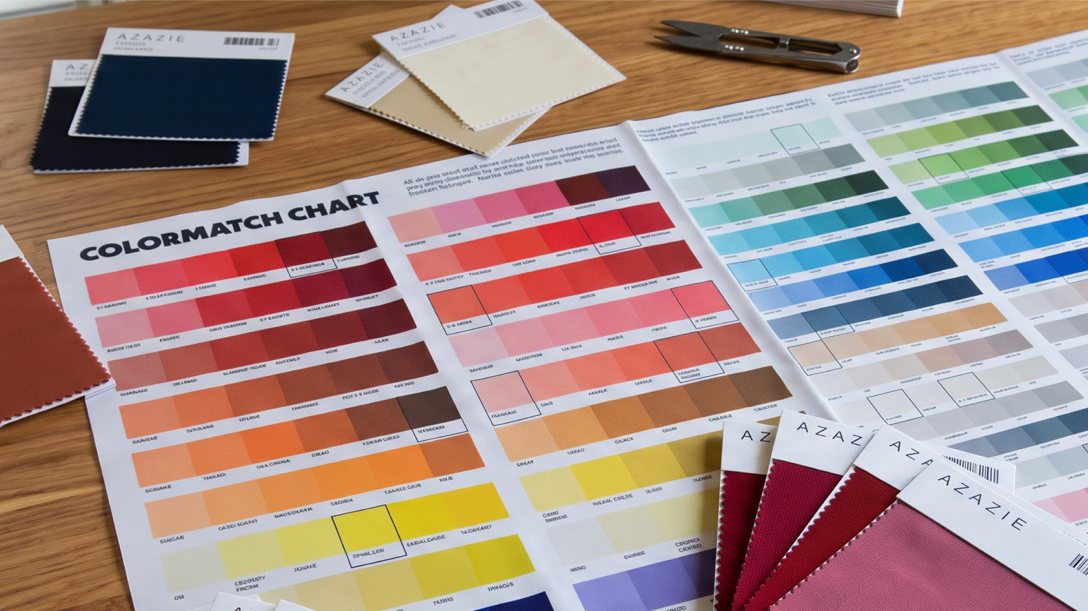
The Knotty Tie Color Match Chart is a physical library of every color we offer, printed on the same fabric used for our ties, bow ties, pocket squares, and suspenders. Because colors can vary from one screen to another, the chart provides the most accurate representation of how each color will appear on the finished product.
The ColorMatch Chart allows you to compare colors with confidence before placing your order.
Don’t have a chart yet, click below to get yours.
Step 1 : Start with What You're Matching
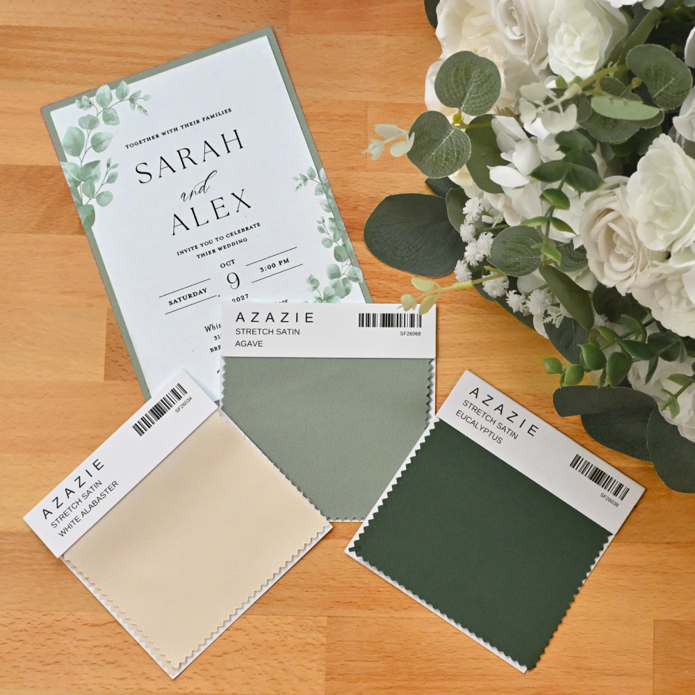
Before comparing colors, identify the item or palette you're trying to coordinate. Having a clear reference will help you narrow your search and find the closest match more quickly.
You might be matching:
- Bridesmaid dresses, invitations, or floral samples for a wedding
- Company logos or brand guidelines for an organization * If matching to Pantone colors see step 5
- Your favorite suit, jacket, or shirt from your wardrobe
- Another fabric, accessory, or printed material
If you don't have a physical reference, that's okay. The chart is just as useful for exploring color options and building a palette from scratch.
Step 2: Compare Colors in the Right Lighting
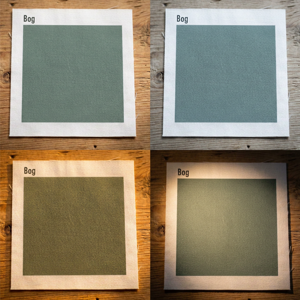
Lighting has a significant impact on how colors appear. A swatch viewed in warm indoor lighting can look noticeably different than it does in natural daylight or under fluorescent lights.
Whenever possible, compare colors under lighting similar to where they'll ultimately be worn. If you're selecting colors for an outdoor wedding, natural daylight is your best reference. For an office event or evening reception, indoor lighting may provide a more realistic comparison.
Want to see how colors will look in photographs? Grab your phone camera and snap a few pics of your colors compared to the chart swatches in various lighting.
Taking a moment to evaluate colors in the right environment can help prevent surprises later.
Step 3 : Find the Closest Match
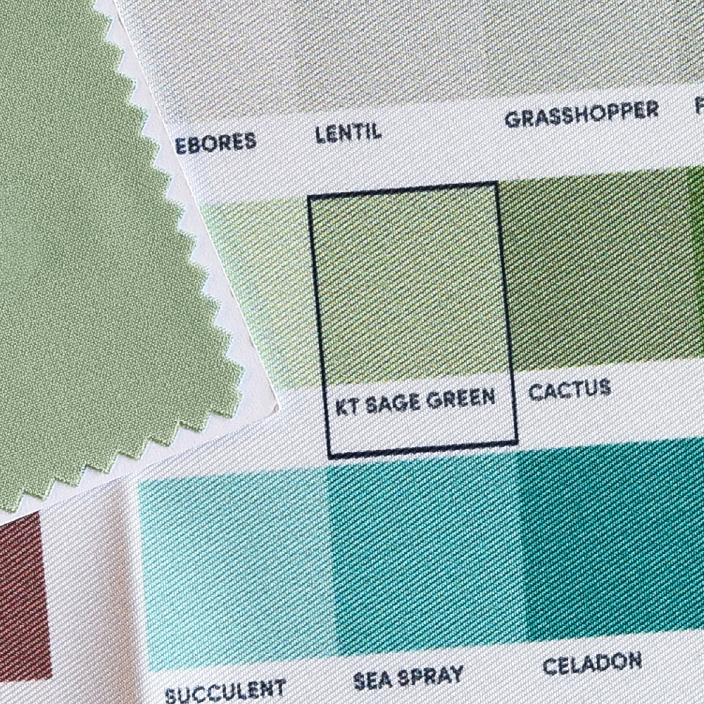
As you compare your reference, look for the swatch that most closely matches its color. An exact match isn't always possible, and that's true for any physical color matching. Differences in fabric texture, material, dye lots, and surface finish all influence how color is perceived.
Rather than aiming for perfection, focus on finding the closest visual match.
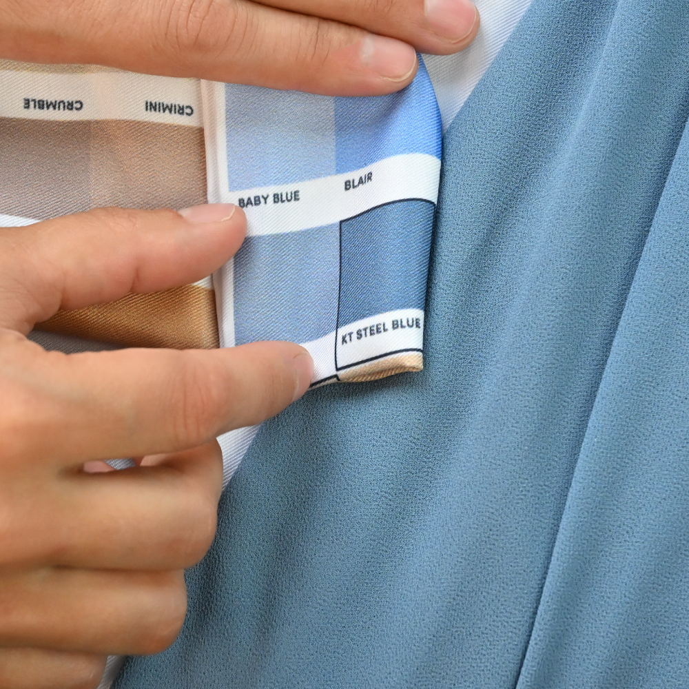
For the most accurate comparison, smooth out your item as much as possible so it's flat against the chart. This reduces confusing shadows and helps you see colors more evenly.
Sometimes the surrounding color swatches on the chart can influence how a color appears - making it seem warmer, cooler, lighter, or darker than it really is.
To confirm your match, isolate a single swatch. The easiest way is to fold the chart so only one swatch is visible, then hold it against the item you're matching. You can also cut a small window into a sheet of white paper and place it over one swatch at a time. Either method removes surrounding colors from view, making it easier to judge the color accurately.
Step 4: Matching a Bridesmaid Dress?
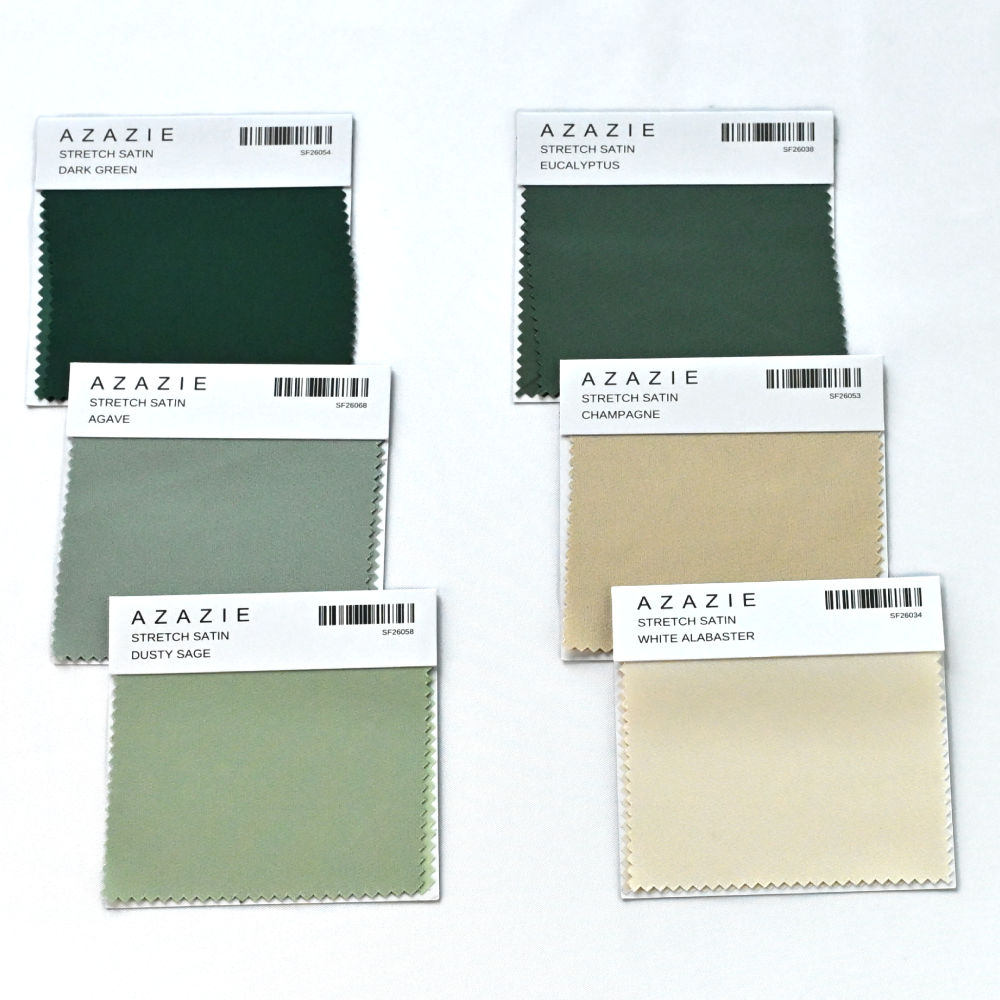
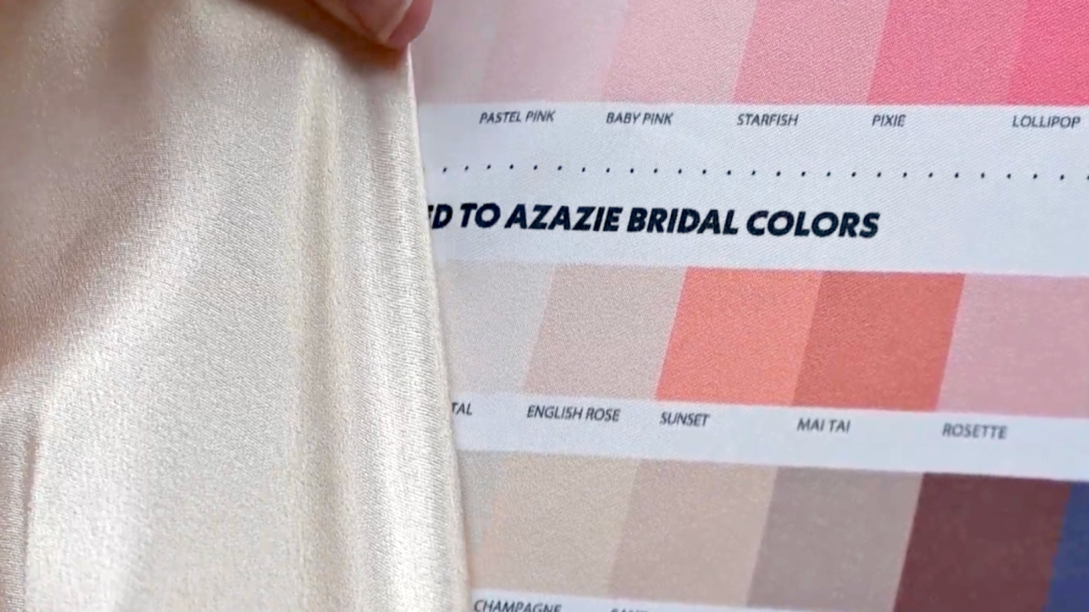
If you're matching an Azazie or David's Bridal dress, begin with the bridal sections at the bottom of the chart. These colors have been carefully matched to many of the most popular dress colors from each collection, making them the fastest place to start.
Unable to find the right match here? Return to the main color library and compare the dress against the full range of swatches to find the closest match.
While the chart includes many colors from Azazie and David's Bridal, some specialty collections are not represented. This includes metallic fabrics and select designer collections such as Vera Wang, Galina Signature, Azazie Atelier, and other limited-edition lines.
Keep in mind that different fabrics and dye lots may vary from the colors included on our chart. If you're unsure whether your dress color is represented, our team is happy to help.
Step 5 : Matching a Pantone or Brand Color?
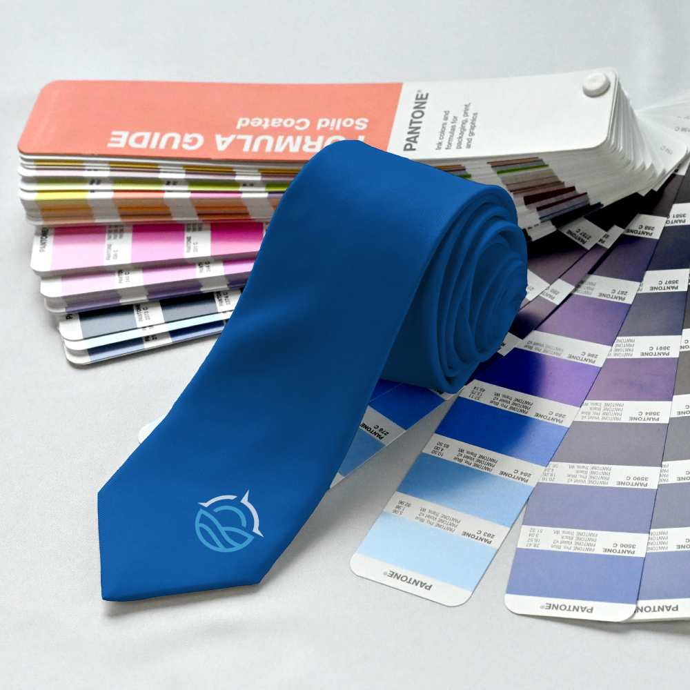
If you're matching a company's branding or working from a Pantone color, the Color Match Chart is still a valuable starting point.
While the chart does not display Pantone colors directly, it allows you to visually compare your reference against our printed fabric colors to find the closest match.
If you're creating a custom pattern, you can also provide your Pantone colors during the design process. Our design team can apply those exact values to your artwork, ensuring your branding remains consistent throughout the final design.
Step 6: Building a Color Palette
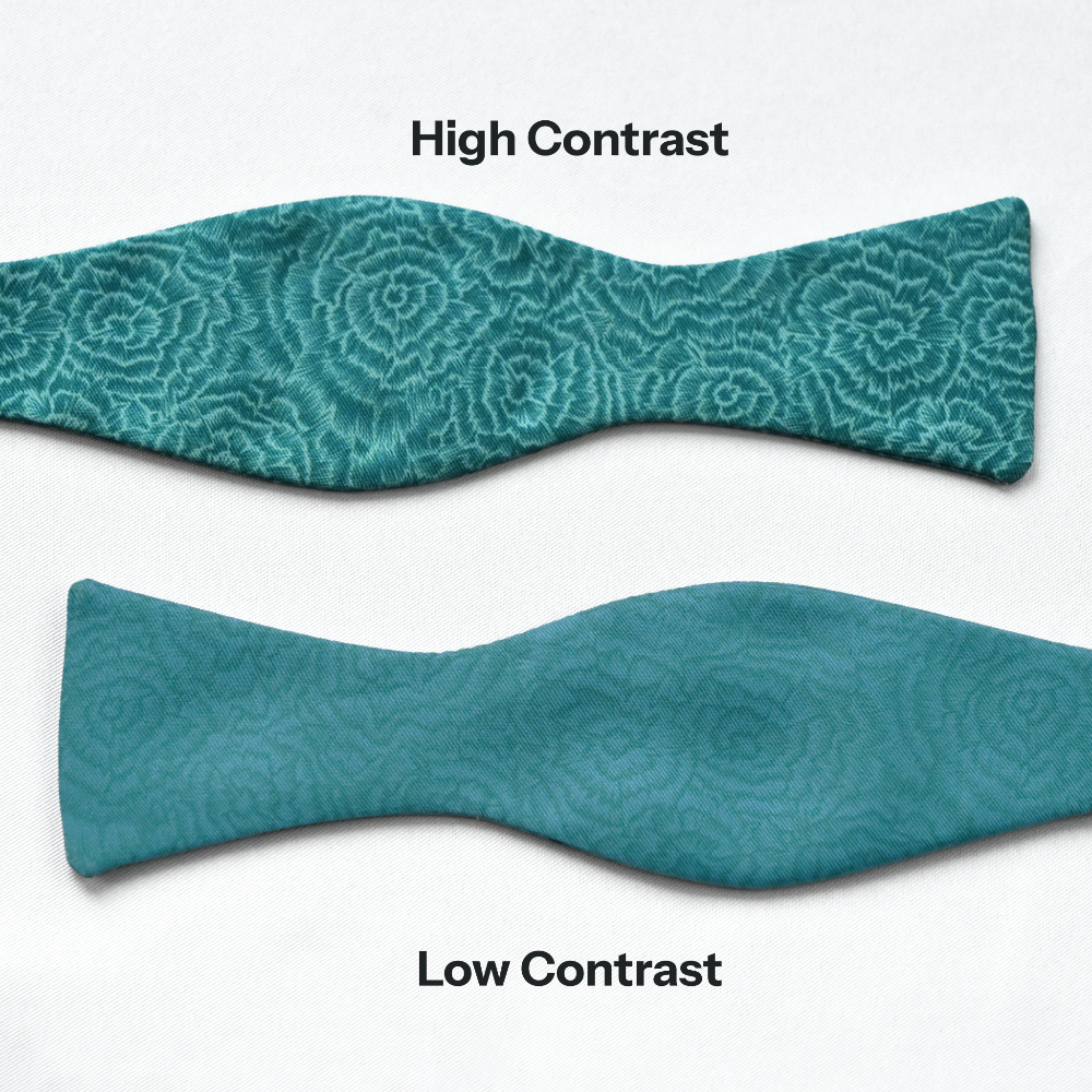
Choosing colors that work well together involves more than selecting your favorites. Contrast plays an important role in how a pattern looks once it's printed.
Two colors may appear different on the chart but still be very similar in lightness, causing the details of a pattern to blend together. Likewise, colors from different families can sometimes share nearly the same value, making them less distinct than expected.
A simple way to create a balanced palette is to combine light, medium, and dark shades. Varying the value of your colors creates depth, improves readability, and helps each design element stand out.
If you're unsure, gather together the color squares of the palette you are considering and take a step back and view them from a few feet away. If the colors begin to blend together at a distance, increasing the contrast will often create a stronger finished product.
Step 7 : Know Your Color Count
Our patterns are printed using anywhere from two to six colors, depending on the design. We also offer solid color products you can customize in any color you like. Solids offer a simple, classic option that pairs well with any wedding theme.
As you build your palette, keep this limitation in mind. If you've selected more colors than your chosen pattern supports, you may need to simplify your palette before placing your order.
Limiting your color selection doesn't necessarily make a design less interesting. In many cases, a thoughtfully curated palette of just two or three colors creates a cleaner, more timeless result.
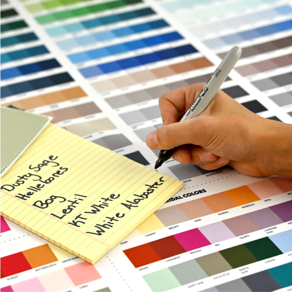
Step 8: Record Your Color Names
Once you've finalized your selections, write down the names of each color. The color names allow you to quickly find the exact same colors in our online customizer.
Recording your selections also makes it easy to share your palette with friends, coworkers, or anyone else involved in the design process.
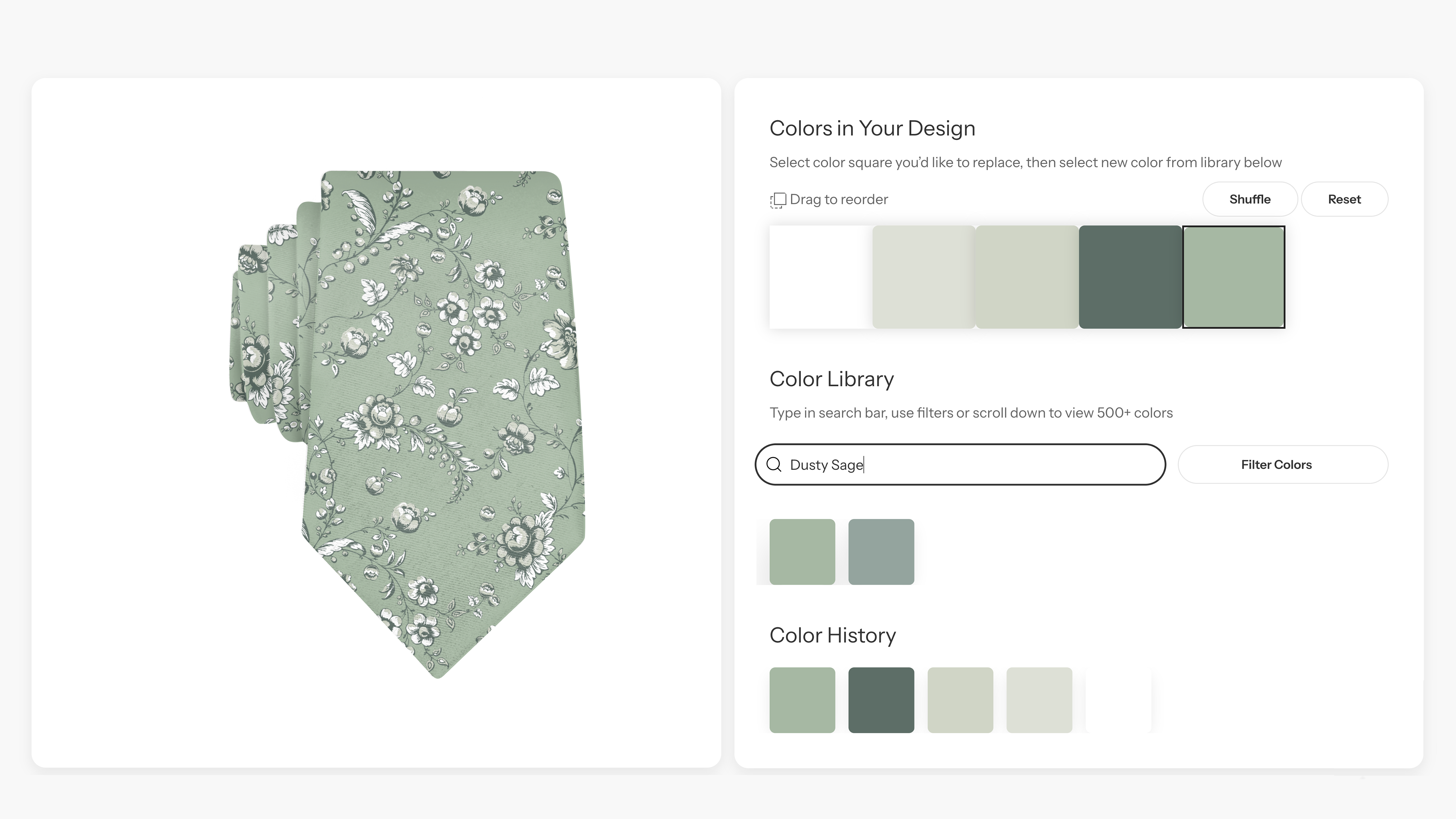
Bringing Your Colors into the Customizer
Once you've selected your colors, head to our website and choose the product you'd like to customize, and click “Customize.”
To change the colors in your design, first select an existing color swatch in the top section. Then type in your desired color name and select it to apply it to the design, replacing the existing color. Because you've already confirmed your choices using the physical chart, there's no need to rely on a digital color picker or guess how a color might appear on screen.
As you build your design, you'll see your selected colors applied in real time, making it easy to experiment while keeping your palette consistent.
When you're finished, save your design by clicking “Create My Product.” You can save your design to your wishlist, share the product link with anyone involved in the order, or add to cart. You can even apply that same pattern and palette to any other piece you need to complete the look.
Whether you're coordinating with a wedding party, collaborating with coworkers, or collecting feedback from a client, everyone can review the exact same design without trying to describe colors over email or text.
A Few Things to Keep in Mind
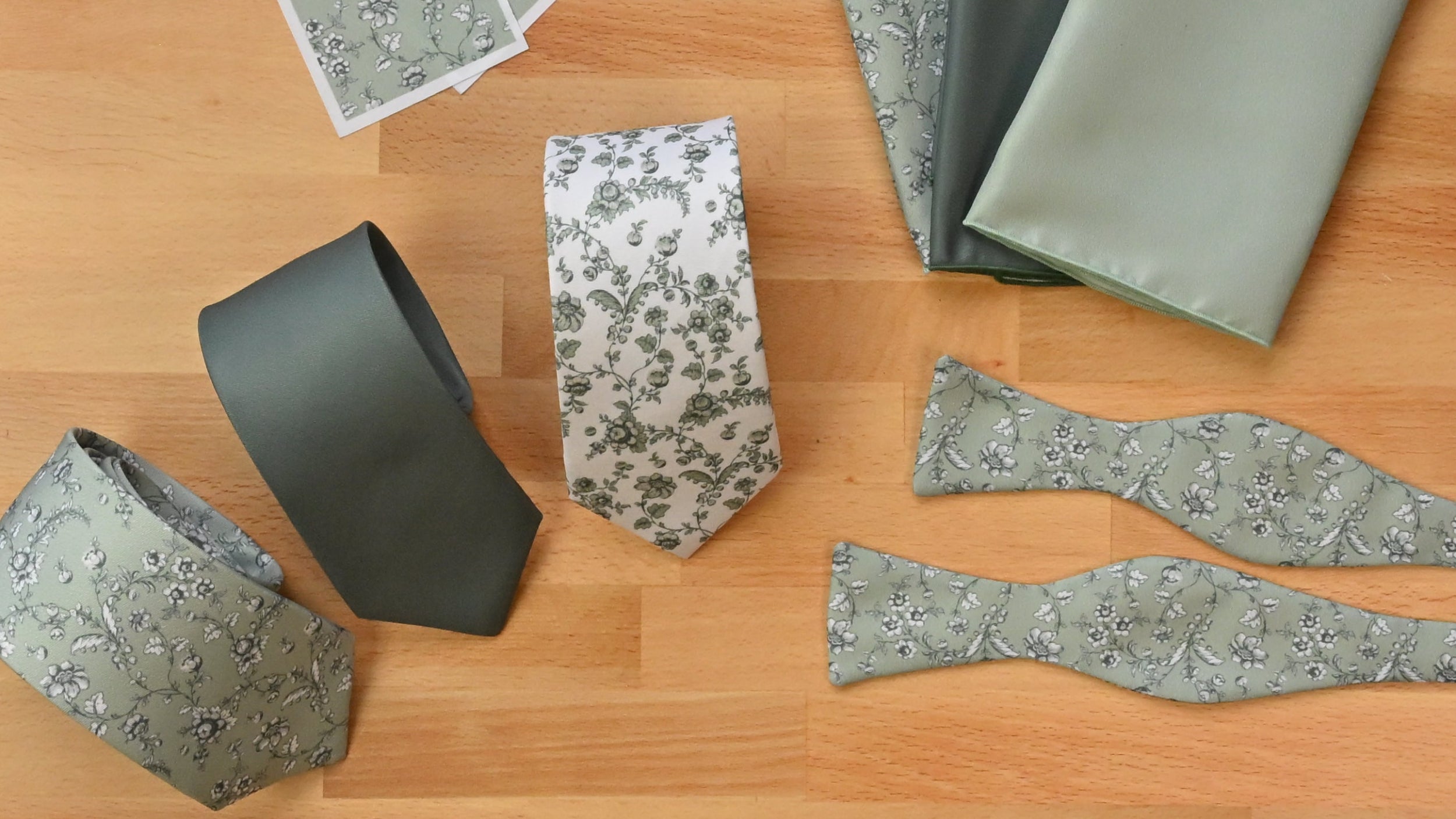
The Color Match Chart is printed on our standard recycled twill fabric used for our neckties, bow ties and pocket squares. Colors may appear slightly different on fabrics that are sheer, translucent, highly textured, or reflective.
If you're comparing materials with a noticeable sheen or texture, expect some variation in how the color is perceived.
Even under ideal conditions, no two materials display color exactly the same way. Fabric type, texture, weave, finish, and dye lots all influence how a color appears.
The goal of the Color Match Chart is to help you find the closest possible match, giving you confidence before placing your order.
If you'd like to see your colors before committing to a full order, you can request printed test swatches of your custom design.
Seeing your selected colors on fabric is the best way to confirm your choices and ensure they're exactly what you envisioned.
Contact our helpful customer service team to learn more about test swatches or get a second opinion on your color combinations.
Final Thoughts on Color Matching
The Color Match Chart was designed to make color selection more accurate, more consistent, and ultimately more enjoyable. Seeing colors in person removes much of the uncertainty from the process of ordering custom accessories
Take your time, compare colors thoughtfully, and don't be afraid to view your options in different lighting or from different distances. A few extra minutes spent selecting the right palette can make all the difference in the finished product.
If you ever have questions or need a second opinion, our team is always happy to help. We're here to make sure you feel confident in every color you choose.


